Color Palettes for Branding: Choosing colors for a brand sounds simple until you actually have to do it.
At first, picking a few colors can feel exciting. You open a color picker, choose a beautiful shade of blue, add a soft beige, maybe throw in a dark brown, and think you’ve found the perfect palette.
Then you put those colors on a logo.
Something feels wrong.
You try them on Instagram posts.
They don’t look consistent.
You put the same colors on a website.
Suddenly the beige looks too yellow, the blue looks too cold, and the dark color feels almost black.
I’ve learned that creating a good branding color palette isn’t simply about finding colors that look pretty together. The colors need to communicate something about the brand and work across different situations.
This is where free AI tools can make the process much easier.
Instead of randomly searching through thousands of color combinations, I can describe the brand to an AI tool and use its suggestions as a starting point. I can ask for a luxury palette, a playful palette, an earthy palette, a minimalist palette, or something completely specific to a particular audience.
I still make the final design decisions myself.
That’s important.
AI can suggest colors, but branding requires human judgment.
In this guide, I’ll explain how I use free AI tools to generate aesthetic color palettes for branding, how to write better prompts, which tools I find useful, how to test palettes, and how to turn an AI-generated color combination into a practical brand color system.
What Is a Branding Color Palette?
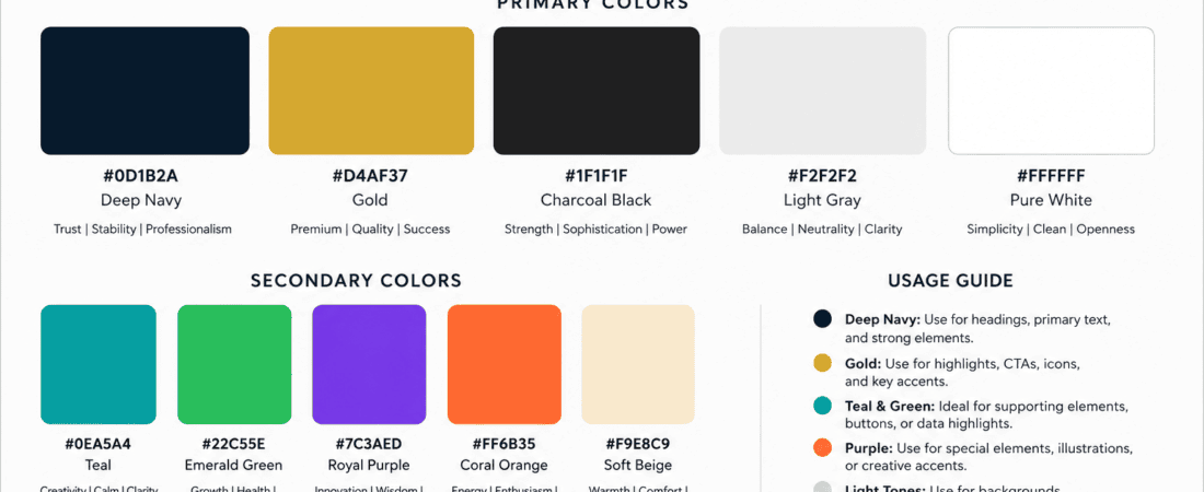
A branding color palette is a carefully selected group of colors that represents a brand visually.
It normally includes more than just two or three random colors.
A practical brand palette can contain:
- Primary color
- Secondary color
- Accent color
- Background color
- Dark or text color
- Neutral shades
For example, a modern skincare brand might use:
Primary: Soft sage green
Secondary: Warm cream
Accent: Muted terracotta
Text: Deep charcoal
Background: Off-white
The purpose isn’t simply to make the brand attractive.
The colors should create consistency.
When someone sees the brand’s Instagram post, website, packaging, presentation, or advertisement, the colors should feel like they belong to the same visual identity.
Why Aesthetic Color Palettes Matter in Branding
A strong color palette can make a brand feel:
- Premium
- Friendly
- Modern
- Traditional
- Energetic
- Calm
- Natural
- Creative
- Professional
- Luxurious
This is why color selection deserves more attention than simply choosing your favorite colors.
Imagine two brands selling the same product.
One uses bright neon pink, orange, and yellow.
The other uses charcoal, cream, and muted gold.
Even before reading the brand names, you’d probably expect completely different experiences.
That’s the power of visual communication.
How AI Changes the Color Palette Process
Before using AI, I would often start with a vague idea such as:
“I want a nice blue color.”
That’s not enough information.
AI becomes much more useful when I describe the brand.
For example:
“Create a sophisticated color palette for a premium skincare brand targeting women aged 25–40. The visual identity should feel clean, elegant, natural, modern, and slightly luxurious. Avoid overly bright colors. Include a primary, secondary, accent, background, and text color with HEX codes.”
Now the AI has context.
Instead of generating random colors, it can try to connect the palette with the brand’s personality.
My Basic AI Color Palette Prompt
This is one of the prompts I use when starting a branding project:
“Act as a professional brand designer. Create a cohesive color palette for a [type of business] targeting [audience]. The brand should feel [3–5 personality words]. Suggest 5 colors: primary, secondary, accent, background, and text. Provide HEX codes and explain the role of each color. Make sure the colors work together across social media, website design, packaging, and print.”
The explanation is useful because I don’t just want color codes.
I want to understand why the colors were selected.
1. ChatGPT — My First Choice for AI Color Palette Brainstorming
ChatGPT is usually where I start when I need to brainstorm a branding direction.
My experience using ChatGPT
What I like is that I can explain the brand in normal language.
For example, I might write:
“I’m designing a logo and social media identity for a small coffee shop. The brand should feel cozy, sophisticated, warm, slightly vintage, and approachable. I don’t want the typical brown coffee-shop palette. Give me three different five-color palettes with HEX codes.”
This gives me multiple directions.
I might receive one warm palette, one muted palette, and one more modern interpretation.
I don’t automatically choose the first suggestion.
I compare the options.
Then I might say:
“Make palette 2 slightly more premium. Replace the darkest brown with a deep green and make the beige less yellow.”
This iterative process is where I find AI particularly useful.
Instead of manually experimenting with every color, I can describe what isn’t working and ask for another version.
What I like most
The conversational approach.
I can keep explaining the brand until the palette gets closer to what I want.
Best for
- Branding brainstorming
- Color psychology ideas
- HEX suggestions
- Palette variations
- Creative direction
2. Canva — My Favorite When I Want to See Colors in a Design
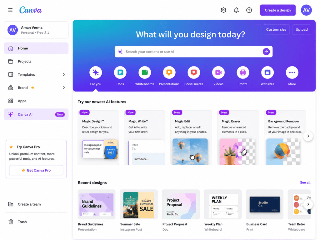
Canva is especially useful for me when I don’t want to judge colors only as little squares on a screen.
My experience using Canva
A color can look beautiful in a palette but completely different when applied to a real design.
For example, a muted green might look elegant as a color swatch.
But once I use it as a background behind white text, the contrast might not be strong enough.
That’s why I like taking a generated palette into an actual design.
I can create a mockup containing:
- Logo
- Instagram post
- Business card
- Website section
- Product card
Then I can see how the colors behave together.
This is one of the most important parts of my process.
I don’t ask:
“Are these colors pretty?”
I ask:
“Do these colors work?”
That’s a very different question.
What I like most
I can move from color inspiration to actual branding visuals quickly.
Best for
- Brand moodboards
- Social media designs
- Logo presentations
- Brand boards
- Testing palettes visually
3. Adobe Color — My Go-To for Refining Color Relationships
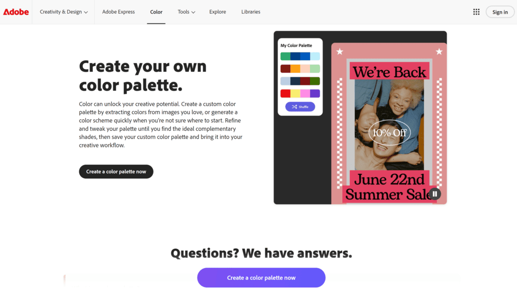
Adobe Color is one of the tools I like when I already have one or two colors and want to develop the rest of the palette.
My experience
Sometimes I don’t need AI to invent everything.
I already have a brand color.
For example:
#5B7C72
I might like this muted green but have no idea what colors should accompany it.
Adobe Color lets me explore relationships between colors and build a more structured palette.
I can experiment with different color harmony approaches such as:
- Analogous
- Complementary
- Triadic
- Monochromatic
This is useful because it gives me more control over the relationship between colors.
If AI gives me a beautiful primary color, I can use a color tool like Adobe Color to investigate what actually works around it.
What I like most
It is useful for refining an idea rather than starting completely from zero.
Best for
- Color harmony
- Professional palettes
- Refinement
- Designers
- Existing brand colors
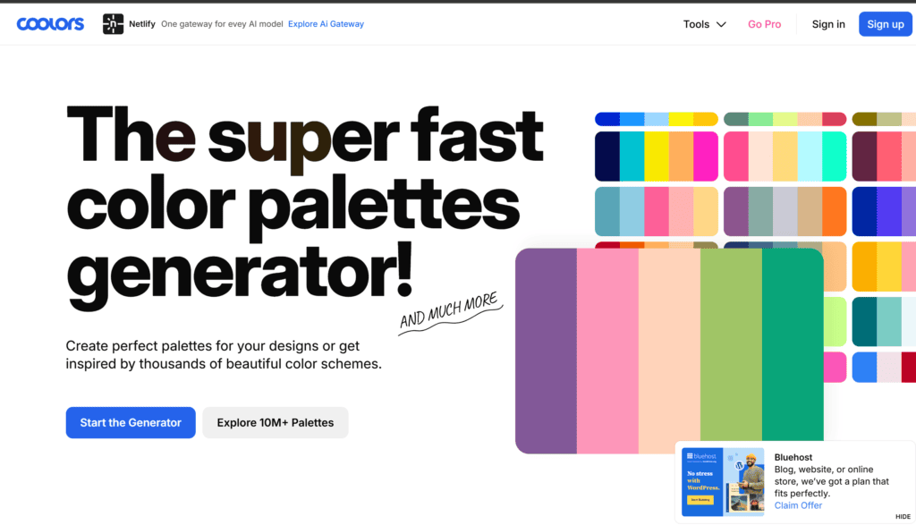
4. Coolors — One of My Favorite Tools for Fast Palette Exploration
Coolors is extremely useful when I want to explore a large number of combinations quickly.
My experience using Coolors
Sometimes I know the mood but don’t know the exact colors.
For example:
“I want something earthy, calm, modern, and premium.”
Instead of spending an hour manually picking colors, I can generate combinations and start locking the colors I like.
The interesting part is that I don’t have to accept an entire palette.
If I like three colors but hate one, I can keep the good colors and continue experimenting around them.
This is much closer to how I actually work as a designer.
I don’t necessarily expect the tool to give me a perfect palette immediately.
I use it to help me discover combinations I might not have considered.
What I like most
Speed.
Best for
- Fast experimentation
- Mood-based palettes
- Designers
- Creative exploration
5. Khroma — Useful When I Want Personalized Color Inspiration
Khroma takes a different approach to color discovery.
My experience
Instead of simply generating random palettes, I find tools like this useful when I’m trying to discover combinations that fit my own visual preferences.
This matters because branding isn’t only about theoretical color harmony.
Designers develop personal preferences.
I may naturally gravitate toward:
- Muted colors
- Warm neutrals
- Deep greens
- Dusty pinks
Another designer may prefer:
- High contrast
- Bright colors
- Strong blues
- Saturated oranges
When a tool learns or works around those preferences, the results can feel more relevant.
What I like most
It can help me discover combinations outside the obvious choices.
Best for
- Inspiration
- Experimental palettes
- Creative designers
- Finding unusual combinations
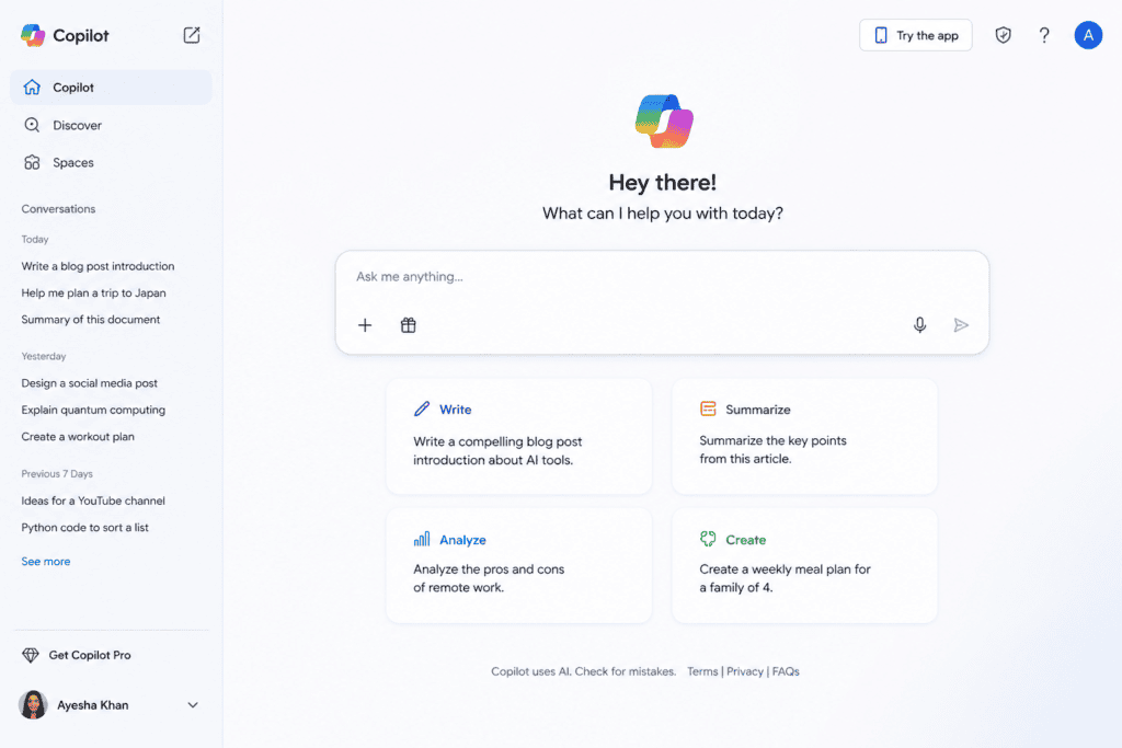
6. Microsoft Copilot — Useful for Brand Color Brainstorming
Microsoft Copilot can also be useful when I want an AI-generated starting point.
My experience
I use it similarly to a general AI assistant.
For example:
“Suggest a modern color palette for a digital marketing agency that wants to look creative, trustworthy, youthful, and professional. Avoid generic corporate blue.”
That last instruction is important.
Without it, AI often falls back on predictable combinations.
I can then ask:
“Give me three alternative palettes using less common colors.”
This is where I find conversational AI useful.
It isn’t necessarily my final color-picking tool.
It’s a brainstorming partner.
What I like most
I can explore different creative directions quickly.
Best for
- Initial ideas
- Brand mood exploration
- Alternative palettes
- Color descriptions
7. Gemini — Useful for Exploring Brand Personality
Google Gemini can also help me connect brand personality with visual direction.
My experience
Sometimes I start with words rather than colors.
For example:
Elegant + youthful + feminine + modern + confident
I’ll ask AI:
“What color characteristics would communicate these brand qualities? Then suggest a five-color palette with HEX codes.”
This is slightly different from simply saying:
“Give me pink colors.”
The AI is first thinking about the emotional direction.
That gives me more useful results.
What I like most
I can start with brand personality rather than technical color selection.
Best for
- Brand strategy
- Personality exploration
- Color concepts
- Creative brainstorming
Don’t Ask AI for “Beautiful Colors”
This is one of the biggest improvements I’ve made in my own prompting.
“Beautiful” is subjective.
Instead of:
“Give me beautiful colors.”
I describe what the brand needs to communicate.
For example:
“Create a palette that feels earthy, sophisticated, calm, natural, and premium.”
Or:
“Create a palette that feels energetic, youthful, playful, and bold without looking childish.”
These descriptions give AI something to work with.
Use Brand Personality to Generate Colors
Before choosing colors, I like defining the brand personality.
Ask:
Is the brand luxurious?
Consider:
- Deep neutrals
- Black
- Champagne
- Muted metallic-inspired colors
Is it playful?
Consider:
- Bright accents
- Vibrant secondary colors
- Strong contrast
Is it natural?
Consider:
- Sage
- Olive
- Sand
- Terracotta
- Warm neutrals
Is it technological?
Consider:
- Cool blues
- Deep navy
- Violet
- Cyan accents
- Dark backgrounds
Is it feminine?
This doesn’t automatically mean pink.
It could use:
- Plum
- Dusty rose
- Burgundy
- Warm cream
- Soft mauve
AI is particularly useful here because it can generate alternatives to predictable color choices.
Create Different Palette Directions Before Choosing One
I rarely recommend generating only one palette.
I prefer asking AI for three or four directions.
For example:
Direction 1: Minimal Luxury
Black + cream + muted gold + warm gray
Direction 2: Natural Premium
Forest green + sage + beige + terracotta
Direction 3: Modern Feminine
Plum + dusty rose + cream + charcoal
Direction 4: Bold Contemporary
Deep navy + electric blue + coral + off-white
Now I can compare them.
This makes the branding decision much easier.
Build a Five-Color Brand Palette
For many small branding projects, five colors are a practical starting point.
I usually structure them like this:
1. Primary
The main brand color.
2. Secondary
Supports the primary.
3. Accent
Used sparingly to attract attention.
4. Background
Used for surfaces and layouts.
5. Text
Used for headings and body content.
This is much more practical than having twelve “brand colors.”
Don’t Use Every Color Equally
One of the biggest mistakes I see in branding is giving every color the same visual importance.
A better approach is to create hierarchy.
For example:
Primary: 40%
Neutral/background: 35%
Secondary: 15%
Accent: 10%
These percentages don’t have to be exact.
They’re simply a useful way to think about visual balance.
If the accent color is supposed to attract attention, I don’t want it covering the entire design.
Ask AI for HEX, RGB, and CMYK
If I’m creating a professional brand identity, I don’t stop at HEX codes.
I might ask:
“Provide HEX, RGB, and approximate CMYK values for each color. Explain which values should be treated as the primary digital reference.”
HEX is especially useful for:
- Websites
- Social media
- Digital graphics
RGB is useful for:
- Digital displays
- Screens
CMYK is relevant for:
- Business cards
- Packaging
- Brochures
However, I always treat automatically generated CMYK conversions as starting points and check them with the intended printer or color workflow when print accuracy matters.
Test Color Contrast Before Using the Palette
This step is easy to skip.
I don’t recommend skipping it.
A beautiful palette can still create terrible readability.
For example, light beige text on a white background might look elegant in a moodboard.
It’s not necessarily readable.
I test combinations such as:
Dark text + light background
White text + dark background
Accent + neutral
Primary + background
Tools such as Adobe Color and other accessibility-oriented color checkers can help evaluate contrast.
For websites and interfaces, accessibility should be part of the decision rather than something checked at the end.
Use AI to Generate Accessible Palette Alternatives
I can also ask AI:
“This palette contains #D9C2A7 as the background and #B58A72 as the text color. Suggest darker text alternatives that preserve the warm aesthetic while improving readability.”
This is a much better use of AI than asking:
“Make it accessible.”
I’m giving it a specific problem.
How I Create a Color Palette From a Logo
Sometimes the logo already exists.
In that case, I don’t want to start from zero.
I identify the main colors from the logo and ask AI:
“This logo uses dark green #234E3A and cream #F3EBDD. Create a complete five-color brand palette around these two colors. Keep the existing colors unchanged and add complementary secondary, accent, and neutral colors.”
This approach keeps the existing visual identity intact.
How to Create a Palette From a Moodboard
Moodboards are another excellent starting point.
Suppose my moodboard contains:
- Natural textures
- Wooden surfaces
- Warm sunlight
- Green plants
- Cream fabrics
- Terracotta objects
I can describe those visual references to AI.
For example:
“Create a five-color brand palette inspired by warm sunlight, sage leaves, natural wood, cream linen, and terracotta ceramics. The palette should feel organic, premium, calm, and modern.”
This gives the AI a visual story to translate into colors.
Use Image-Based Color Extraction
If you already have an image representing the brand’s mood, color extraction tools can help identify dominant colors.
This is particularly useful for:
- Photography-based brands
- Restaurants
- Fashion
- Interior design
- Travel brands
- Nature brands
I can take one strong reference image and build the initial palette around it.
Then AI can help me refine the result.
How I Use AI for a Restaurant Brand
Imagine I’m designing a restaurant identity.
I might tell AI:
“Create a modern color palette for a casual pizza restaurant targeting young adults and families. The brand should feel energetic, friendly, appetizing, and contemporary. Avoid overly dark restaurant colors. Include a strong primary color, warm neutral, accent, background, and text color.”
The important thing is that I’m describing the experience.
Not just asking for “pizza colors.”
How I Use AI for a Skincare Brand
For skincare, I might use:
“Create a sophisticated five-color palette for a clean skincare brand. The brand should feel trustworthy, fresh, minimal, natural, and premium. Avoid overly bright green and generic medical blue. Include HEX codes and explain how each color should be used.”
This gives AI constraints.
Those constraints usually improve the result.
How I Use AI for a Tech Brand
For technology:
“Create a contemporary color palette for a SaaS company targeting small businesses. The brand should feel trustworthy, innovative, intelligent, approachable, and modern. Avoid generic corporate blue as the dominant color. Include a primary, secondary, accent, background, and text color.”
Again, I’m deliberately avoiding the most obvious answer.
How to Create an Aesthetic Instagram Color Palette
Instagram branding needs special attention because colors appear repeatedly across a grid.
I like creating a palette with:
- One dominant color
- Two supporting colors
- One accent
- One neutral
Then I use the colors consistently across:
- Posts
- Reels covers
- Carousels
- Stories
- Highlights
- Quotes
- Promotional graphics
The goal is not to make every post identical.
The goal is to make the collection feel connected.
Use AI to Create a Social Media Color System
A useful prompt is:
“Using this brand palette, create a social media color system. Explain which color should be used for backgrounds, headlines, buttons, promotional posts, educational posts, quote graphics, and Instagram story templates. Keep the visual identity consistent without making every design look identical.”
This gives me a practical system rather than just five color codes.
Don’t Change Your Palette Every Week
This is another mistake.
You discover a beautiful new color combination and suddenly want to redesign everything.
I try to avoid that.
A brand needs consistency.
Once the palette is working, I use it repeatedly.
Instead of changing colors, I create variety through:
- Layout
- Typography
- Photography
- Illustration
- Texture
- Composition
- White space
The color system remains recognizable.
Common AI Color Palette Mistakes
1. Choosing colors based only on aesthetics
A beautiful palette isn’t automatically a good brand palette.
2. Using too many colors
More isn’t always better.
3. Ignoring contrast
Some combinations look good but are difficult to read.
4. Using predictable colors
AI often defaults to familiar combinations.
Give it constraints.
5. Not testing the palette in real designs
Always create mockups.
6. Ignoring print
Digital colors don’t always reproduce exactly in print.
7. Making every design use every color
Create hierarchy.
8. Changing the palette too often
Consistency is part of branding.
My Complete AI Color Palette Workflow
This is the process I’d recommend if you’re starting from scratch.
Step 1: Define the brand
Write down:
- Industry
- Audience
- Personality
- Positioning
- Competitors
- Desired emotional response
Step 2: Create three palette directions
Use AI to generate alternatives.
Step 3: Select the strongest direction
Don’t choose only because it looks pretty.
Ask whether it fits the brand.
Step 4: Refine the colors
Use tools such as Adobe Color or Coolors.
Step 5: Define color roles
Assign:
- Primary
- Secondary
- Accent
- Background
- Text
Step 6: Check contrast
Make sure important text remains readable.
Step 7: Create mockups
Test the palette on real designs.
Step 8: Test different backgrounds
See how the colors behave on light and dark surfaces.
Step 9: Create brand guidelines
Document HEX, RGB, CMYK, usage rules, and examples.
Step 10: Keep the system consistent
Use the palette across the brand.
A Master AI Prompt for Branding Color Palettes
If I want a more detailed starting point, this is the kind of prompt I use:
“Act as a senior brand identity designer. I am developing the visual identity for a [business type] called [brand name]. The target audience is [audience]. The brand personality is [personality traits]. The brand should communicate [emotions]. Competitors commonly use [colors/styles], so avoid looking too similar. Generate three distinct five-color palettes. For each palette provide HEX codes, primary/secondary/accent/background/text roles, color psychology, recommended usage percentages, and examples of where each color should be used. Prioritize readability, visual harmony, brand differentiation, and practical use across websites, social media, packaging, and print.”
This is much more useful than:
“Give me a nice color palette.”
How to Make AI Generate Less Generic Palettes
I often add negative instructions.
For example:
“Avoid generic startup blue.”
or:
“Don’t use the typical black-and-gold luxury combination.”
or:
“Avoid pastel pink.”
or:
“Do not use more than one highly saturated color.”
These constraints can make the results more interesting.
AI Shouldn’t Decide Your Brand Colors Alone
Even though AI is useful, I wouldn’t let it make the final decision without human review.
There are things AI doesn’t automatically understand:
- Local cultural associations
- Existing brand recognition
- Competitor visual identities
- Printing limitations
- Actual customer reactions
- Personal design preferences
- Production constraints
AI gives me possibilities.
Design judgment chooses the direction.
Frequently Asked Questions
Can AI generate a complete brand color palette?
Yes. AI can generate color combinations, HEX codes, color roles, and usage suggestions. I recommend using those results as a starting point and testing them in actual designs.
What is the best free AI tool for color palettes?
There isn’t one universal winner. I find ChatGPT useful for brand-based brainstorming, Canva useful for visual testing, Adobe Color useful for color relationships, and Coolors useful for fast experimentation.
Can ChatGPT generate HEX color codes?
Yes. You can ask it to provide HEX codes along with color roles and explanations.
How many colors should a brand palette have?
There is no fixed rule, but five colors are a practical starting point for many small brands: primary, secondary, accent, background, and text.
Can AI choose colors based on brand personality?
Yes. This is actually one of the more useful ways to prompt AI. Describe the desired personality and audience rather than simply asking for “pretty colors.”
Can AI create accessible color palettes?
AI can suggest higher-contrast alternatives, but important accessibility decisions should be checked using appropriate contrast-testing tools.
Can I use AI-generated colors commercially?
Color combinations themselves generally aren’t treated like copyrighted artwork in the same way as an image or illustration, but you should still check your specific tool’s terms and consider trademark/brand-confusion issues when developing a commercial identity.
Should I use AI for my logo and colors?
AI can be useful for brainstorming both. However, a professional logo and complete visual identity require more than generating attractive colors. You still need typography, spacing, logo construction, usage rules, and a consistent visual system.
Final Thoughts
Creating a beautiful branding color palette doesn’t have to begin with staring at a color picker for an hour.
AI has made the exploration stage much faster.
I can describe a brand in a few sentences and immediately get several possible visual directions.
I can ask for something luxurious.
Then something earthy.
Then something modern.
Then something completely different.
I can reject colors I don’t like and ask for alternatives.
I can take an existing brand color and build a complete palette around it.
I can ask for HEX codes.
I can ask for usage recommendations.
And I can use tools like Adobe Color and Coolors to refine the relationships between the colors.
But the part I don’t want AI to replace is the actual design judgment.
When I select a color, I don’t just ask:
“Does this look aesthetic?”
I ask:
“Does this communicate the right feeling?”
“Will it work on social media?”
“Can people read text placed over it?”
“Does it work on a website?”
“Will it still make sense in print?”
“Does it differentiate the brand from competitors?”
“Can I use it consistently for years?”
Those questions turn a pretty color combination into a real brand palette.
My favorite approach is therefore a combination of AI and traditional design tools.
I use conversational AI to explore ideas.
I use color tools to refine combinations.
I use design software to test the colors in real layouts.
I check contrast and readability.
Then I document the final system.
The biggest advantage of AI isn’t that it can magically produce the perfect palette.
It’s that it gives me more directions to explore in less time.
Instead of spending an hour trying random combinations, I can spend that hour comparing meaningful concepts.
And that’s where AI becomes genuinely useful for branding.
Use AI for exploration.
Use design tools for testing.
Use human judgment for the final decision.
A strong brand palette isn’t simply a collection of attractive colors.
It’s a visual language.
When the right colors are used consistently, they can make a brand feel recognizable before someone even reads the name.
That’s ultimately what you’re trying to create.
Check out here if you want to know about Free AI Tools to Create High-Converting Landing Page Layouts