
AI Tools to Create High-Converting Landing Page Layouts: Creating a landing page that looks beautiful is relatively easy.
Creating one that actually converts visitors into leads, subscribers, customers, or buyers is much harder.
I’ve seen plenty of landing pages that look impressive at first glance but don’t make me want to do anything. The colors may be attractive, the animations may be smooth, and the typography may look professional, yet the main message is buried somewhere in the middle of the page.
That’s the problem with designing landing pages around appearance alone.
A high-converting landing page needs a clear structure.
When I build or plan one, I usually think about the visitor’s journey first:
What brought them here?
What problem are they trying to solve?
Why should they trust this offer?
What should they do next?
What might stop them from taking action?
AI tools can make this process much faster.
Instead of starting with an empty canvas, I can describe the business, audience, offer, and conversion goal to an AI tool and get suggestions for the page structure. Some tools can generate layouts, while others are better for writing copy, creating wireframes, improving UX, or turning an idea into an actual website.
In this guide, I’ll walk through some of the best free AI tools I use for creating landing page layouts, how I approach each one, how AI fits into the design process, and how to turn an AI-generated layout into a landing page that feels intentional rather than automatically generated.
What Is a Landing Page Layout?
A landing page layout is the visual and structural arrangement of the elements on a landing page.
It determines where visitors see:
- Headline
- Subheadline
- Hero image
- Product information
- Benefits
- Features
- Social proof
- Testimonials
- Pricing
- FAQ
- Call-to-action
- Contact or signup form
A good layout creates a logical flow.
A visitor should not have to work hard to understand what the page is offering.
For example, a simple SaaS landing page might follow this structure:
Hero → Benefits → How It Works → Features → Social Proof → Pricing → FAQ → CTA
A product landing page might use:
Hero → Product Benefits → Product Images → Reviews → Features → Offer → FAQ → CTA
AI can help me create these structures much faster.
Why Use AI to Design Landing Page Layouts?
The biggest advantage I get from AI is speed.
Normally, I might spend a significant amount of time researching competitors, sketching wireframes, brainstorming sections, and deciding what information belongs above or below the fold.
AI can give me an initial direction in minutes.
For example, I can tell an AI tool:
“Create a landing page structure for a freelance graphic design service targeting small businesses. The primary goal is to generate consultation bookings. Include a strong hero section, service benefits, portfolio proof, testimonials, process, pricing guidance, FAQ, and repeated CTAs.”
Instead of staring at a blank artboard, I have something to work from.
That doesn’t mean I use the AI output exactly as it is.
I treat it as a starting point.
What Makes a Landing Page High-Converting?
Before looking at tools, it’s important to understand what we’re trying to create.
A high-converting landing page usually has several characteristics.
Clear value proposition
Visitors should quickly understand:
What is this?
Who is it for?
Why should I care?
Strong visual hierarchy
The most important information should receive the most visual attention.
Focused CTA
The page should make the desired action obvious.
Trust signals
Testimonials, reviews, logos, statistics, guarantees, case studies, or other credibility indicators can reduce uncertainty.
Low friction
Forms shouldn’t ask for unnecessary information.
Mobile-friendly design
A beautiful desktop layout is useless if the mobile experience is terrible.
Logical flow
Each section should move the visitor closer to a decision.
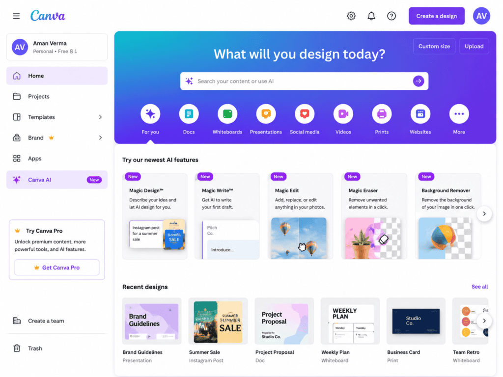
1. Canva — My Favorite for Quickly Turning AI Ideas Into Visual Layouts
Canva is one of the first tools I consider when I want to visualize a landing page concept quickly.
It isn’t just useful for social media graphics. Its design environment makes it easy for me to experiment with page structures, visual hierarchy, colors, typography, and content blocks.
My experience using Canva
I usually don’t begin by designing the final landing page immediately.
Instead, I’ll first create a rough wireframe.
For example:
Hero
Large headline
Short supporting text
CTA button
Product mockup
Then:
Benefits
Three cards
Then:
Social proof
Testimonials or customer logos
Then:
Features
Then:
CTA
This helps me see whether the page feels balanced.
I can also experiment with different layouts without worrying about coding.
If I decide that the testimonial section should come earlier, I can move it.
If the hero feels too crowded, I can simplify it.
That flexibility is what makes Canva useful during the planning stage.
What I like most
It lets me move quickly from an AI-generated idea to something visual.
Best for
- Wireframes
- Visual mockups
- Landing page concepts
- Brand-focused designs
- Non-coders
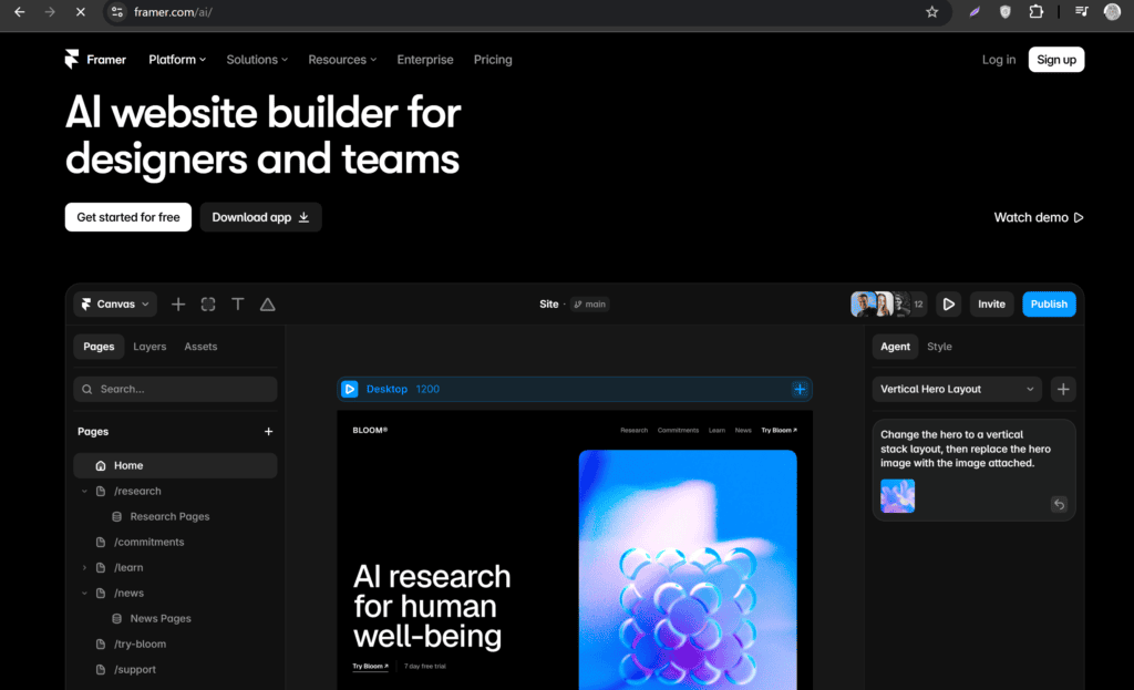
2. Framer AI — My Choice for Turning a Prompt Into a Website Starting Point
Framer is particularly interesting when I want AI to go beyond suggesting sections and actually help create a website structure.
My experience with Framer AI
This is where the workflow starts feeling very different from traditional design.
Instead of opening a blank canvas and manually creating every section, I can describe what I want.
For example:
“Create a modern landing page for an AI writing assistant aimed at freelancers. Use a clean editorial style, strong typography, lots of whitespace, a prominent hero CTA, feature sections, testimonials, pricing, FAQ, and a final signup section.”
The generated result gives me something tangible to evaluate.
Even if the first version isn’t perfect, I can identify what needs changing.
Maybe the hero is too generic.
Maybe the CTA isn’t prominent enough.
Maybe there are too many sections.
That’s much easier to fix than designing every section from scratch.
What I like most
The speed of moving from a written idea to a functioning web concept.
Best for
- Startup landing pages
- SaaS websites
- Portfolio sites
- Designers who want a fast prototype
- AI-assisted website creation
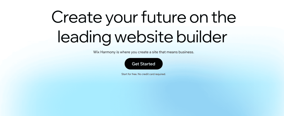
3. Wix AI — Useful When I Want AI to Handle More of the Website Setup
Wix is another platform I find useful for people who want to build a landing page without coding.
Its AI website creation approach allows me to describe a business and let the platform generate an initial website direction.
My experience with Wix AI
I find this especially useful for small businesses.
Suppose I’m creating a landing page for a local photography business.
Instead of manually creating everything, I can describe:
- Business type
- Target audience
- Services
- Brand style
- Desired website purpose
The AI can then provide a starting structure.
I still need to replace generic text and make sure the page actually reflects the business.
That’s an important point.
AI-generated website copy often sounds too generic.
If I see something like:
“We provide exceptional solutions tailored to your unique needs.”
I know immediately that it needs rewriting.
I’d rather say something specific:
“Get professional product photos delivered within five business days.”
Specific beats vague.
What I like most
It reduces the technical barrier for people who aren’t comfortable with website development.
Best for
- Small businesses
- Service businesses
- Beginners
- No-code websites
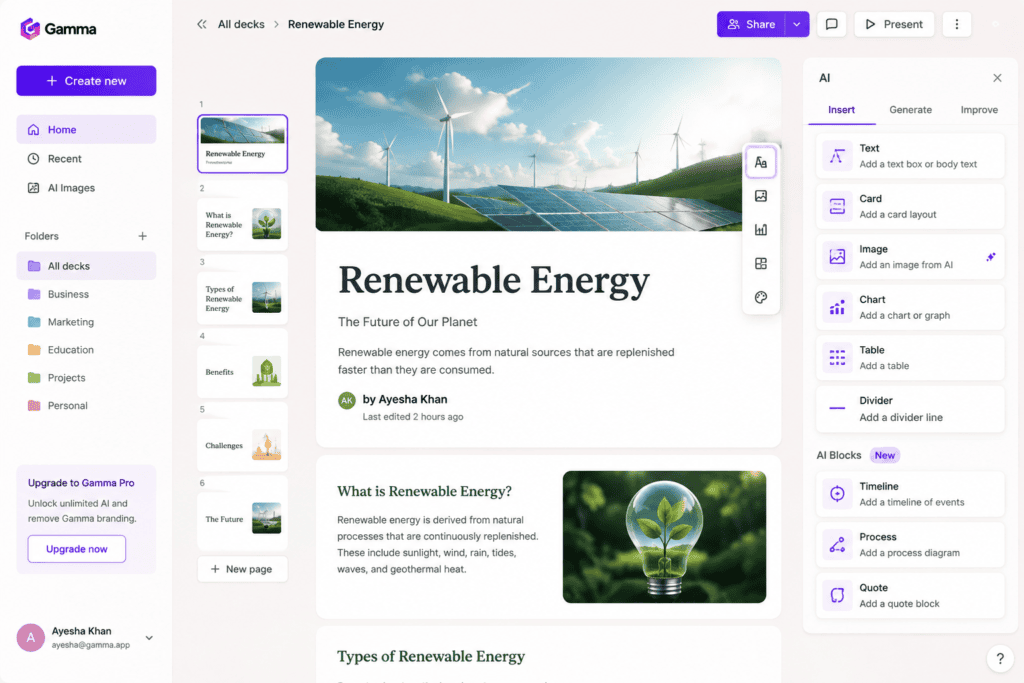
4. Gamma — My Favorite for Planning the Story Before Designing the Page
Gamma is particularly useful when I want to organize information before turning it into a final web experience.
My experience with Gamma
Sometimes my biggest problem isn’t design.
It’s content structure.
I might have twenty things I want to say about a product.
But visitors don’t need all twenty things immediately.
I can use AI to organize the information into a logical narrative.
For example:
Problem
The customer struggles with manual reporting.
Solution
The product automates reporting.
Benefits
Save time, reduce errors, simplify workflows.
Proof
Customer results.
How it works
Three steps.
CTA
Start free.
That structure can then become the foundation for the actual landing page.
What I like most
It helps me think about information hierarchy before getting obsessed with visual design.
Best for
- Content structure
- Landing page planning
- SaaS messaging
- Presentations and web concepts
5. Relume — My Choice for AI-Assisted Website Sitemaps and Wireframes
Relume is particularly useful for people who want to plan websites and wireframes quickly.
My experience with Relume
I find the sitemap and wireframe approach useful because it encourages me to think about structure before visual decoration.
For a landing page, I might define sections such as:
- Hero
- Benefits
- Features
- Testimonials
- Pricing
- FAQ
- CTA
Then I can start thinking about the content and layout within those sections.
This is closer to how I prefer to design professionally.
I don’t want to start with colors and gradients.
I want to start with:
What information does the visitor need?
Once the structure works, visual design becomes much easier.
What I like most
The focus on wireframing and website structure.
Best for
- UX designers
- Web designers
- Agencies
- Website planning
- Wireframes
6. Uizard — Useful for Turning Ideas Into Quick UI Concepts
Uizard is another AI-powered design tool that I find useful during the concept stage.
My experience with Uizard
What makes tools like Uizard interesting is that they can help bridge the gap between an idea and a visual interface.
For example, if I want to create a landing page for a mobile app, I can start by thinking about:
Hero
App screenshot
CTA
Features
Feature cards
Social proof
Ratings and reviews
Final CTA
Then I can visualize the interface without spending hours building every component manually.
I particularly like this approach when I’m still experimenting.
If the design direction doesn’t work, I can change it before investing too much time.
What I like most
Fast interface experimentation.
Best for
- UI concepts
- App landing pages
- Wireframes
- Prototypes
- Beginners
7. Google Gemini — My Tool for Landing Page Copy and Conversion Ideas
Gemini is useful when I’m not necessarily asking it to build the page itself.
I use it as a strategic assistant.
My experience with Gemini
I might give it the complete offer and ask:
“Analyze this landing page offer from the perspective of a first-time visitor. What questions would stop someone from converting?”
This is more useful to me than simply asking it to write a page.
For example, it might identify concerns such as:
- Pricing isn’t clear.
- The target customer isn’t obvious.
- There isn’t enough social proof.
- The CTA is vague.
- The refund policy isn’t explained.
- The product’s main benefit isn’t immediately visible.
Those insights can influence the layout.
What I like most
It can help me think like a visitor rather than just a designer.
Best for
- Copywriting
- Conversion ideas
- FAQ generation
- Objection research
- Content planning
8. ChatGPT — My All-Purpose Landing Page Planning Assistant
ChatGPT is useful to me because I can use it throughout the entire process.
I can ask it to generate:
- Landing page structures
- Headlines
- Subheadlines
- CTA ideas
- Benefits
- Feature descriptions
- FAQs
- Testimonials prompts
- Objection lists
- A/B testing ideas
My experience
I rarely ask:
“Write a landing page.”
That’s too broad.
Instead, I break the project down.
First:
“Create a conversion-focused landing page outline for a social media management service targeting small businesses.”
Then:
“Give me five hero headline options focused on the primary benefit.”
Then:
“Rewrite option 3 so it sounds less corporate.”
Then:
“Create three CTA variations.”
This produces much more usable results.
The Perfect AI Prompt for a Landing Page Layout
Here’s a prompt I frequently use as a starting point:
“Act as a conversion-focused UX designer. Create a landing page structure for [product/service]. The target audience is [audience]. The main conversion goal is [signup/purchase/booking/download]. Identify the visitor’s main problem, desired outcome, objections, trust requirements, and decision-making questions. Then create a section-by-section landing page layout from hero to final CTA. For each section, explain its purpose, recommended content, visual treatment, and CTA if appropriate. Keep the page focused and avoid unnecessary sections.”
This is much better than simply asking AI for “a landing page.”
Start With the Conversion Goal
Before designing anything, I define one primary conversion goal.
It could be:
- Buy a product
- Book a consultation
- Submit a lead form
- Start a free trial
- Download an ebook
- Register for an event
- Join an email list
If I try to make one landing page accomplish everything, it becomes confusing.
A focused landing page usually performs better because the visitor understands what action they are expected to take.
Design the Hero Section First
The hero is one of the most important parts of the page.
I usually include:
Headline
What is the main benefit?
Subheadline
How does the product or service deliver that benefit?
CTA
What should the visitor do?
Visual
What helps the visitor understand the offer?
For example:
Headline:
Create professional social media content in minutes.
Subheadline:
Generate captions, post ideas, and content calendars with an AI assistant designed for small businesses.
CTA:
Start Creating Free
The visitor immediately understands the offer.
Don’t Make Your Headline Clever at the Expense of Clarity
This is something I constantly remind myself of.
A headline like:
“Your Content. Reimagined.”
may sound stylish.
But it doesn’t explain much.
Compare it with:
“Create 30 Days of Social Media Content in Minutes.”
The second one is much clearer.
For conversion-focused landing pages, clarity usually matters more than cleverness.
Use AI to Generate Multiple Headlines
Instead of choosing the first headline AI produces, I ask for several angles.
Benefit-focused
“Create content faster.”
Outcome-focused
“Turn one idea into a month of social content.”
Problem-focused
“Stop spending hours planning social media posts.”
Audience-focused
“Social media planning for busy small-business owners.”
Then I decide which direction best fits the product.
Build the Page Around Customer Objections
This is one of the most useful ways I use AI.
I ask:
“List the top 10 reasons someone might hesitate before buying this product.”
The answers can become landing page sections.
For example:
Objection: “Is it difficult to use?”
→ Add a three-step “How It Works” section.
Objection: “Will it work for my business?”
→ Add examples or case studies.
Objection: “Can I cancel?”
→ Explain the subscription terms.
Objection: “Is my data safe?”
→ Add security information.
Now the landing page isn’t just presenting information.
It’s answering questions.
Add Social Proof at the Right Point
Testimonials aren’t decorative elements.
They reduce uncertainty.
I often place social proof after the visitor understands the product.
A useful sequence can be:
Problem → Solution → Benefits → Proof
rather than:
Hero → Random testimonial → Features
The exact placement depends on the product and audience, but the underlying idea is to use proof when the visitor needs reassurance.
Use AI to Create Testimonial Section Ideas
AI can help me structure the presentation.
For example:
“Design a testimonial section for a SaaS landing page. Suggest three different layouts and explain what information each testimonial should contain.”
I might choose a format featuring:
- Customer name
- Role
- Company
- Short quote
- Result
However, the testimonials themselves should always be genuine.
AI shouldn’t invent customer experiences or fake statistics.
Keep the Number of Sections Under Control
AI has a tendency to produce long pages.
That’s not automatically bad.
Long-form landing pages can work extremely well when visitors need lots of information.
But every section should have a reason to exist.
I ask:
“If I remove this section, does the visitor lose important information?”
If the answer is no, I consider removing it.
Mobile Layout Matters
I never consider a landing page finished after looking at the desktop version.
On mobile:
- Headlines wrap differently.
- Buttons become more important.
- Forms can feel longer.
- Images take up more space.
- Navigation changes.
- Large sections can become exhausting.
I use AI to review mobile UX too.
For example:
“Review this landing page structure from a mobile user’s perspective. Identify sections that may feel too long, confusing, or difficult to interact with.”
That’s a useful second opinion.
Use AI to Improve CTA Placement
A landing page shouldn’t necessarily have only one CTA.
Depending on the page length, I may repeat the primary CTA.
For example:
Hero → CTA
After Benefits → CTA
After Testimonials → CTA
Final Section → CTA
But the CTA should remain consistent.
If the hero says:
Start Free
and the bottom says:
Request a Demo
the visitor may wonder whether these are different actions.
Consistency reduces confusion.
Use AI for A/B Testing Ideas
One of my favorite uses of AI is generating variations for testing.
I can ask:
“Give me five A/B test ideas for this landing page. Focus on elements likely to affect conversion without changing the offer.”
Possible tests include:
- Headline
- CTA text
- Hero image
- Form length
- Social proof placement
- Pricing presentation
- Benefit order
AI doesn’t tell me which version will definitely win.
It helps me generate reasonable hypotheses to test.
Don’t Trust AI Conversion Claims
This is important.
If an AI tool says:
“This layout will increase conversions by 40%.”
I wouldn’t treat that as a fact.
Conversion rates depend on many variables:
- Traffic quality
- Audience
- Offer
- Price
- Brand trust
- Copy
- Design
- Competition
- Device
- Marketing channel
AI can suggest conversion principles.
Actual performance needs real testing.
My Landing Page Design Workflow
Here’s the workflow I find most efficient.
Step 1: Define the offer
What exactly are you selling?
Step 2: Define the audience
Who is the ideal visitor?
Step 3: Identify the main problem
Why would they need the offer?
Step 4: Define the desired outcome
What does success look like?
Step 5: Identify objections
Why might they hesitate?
Step 6: Generate the structure with AI
Create the section order.
Step 7: Build a wireframe
Use Relume, Uizard, Canva, or another design tool.
Step 8: Write the copy
Use AI for drafts, then edit manually.
Step 9: Create the visual design
Apply typography, colors, imagery, and spacing.
Step 10: Build the actual page
Use Framer, Wix, or another website builder.
Step 11: Test mobile
Check the entire experience.
Step 12: Test conversion elements
Review CTAs, forms, navigation, and distractions.
Step 13: Launch
Then collect real data.
Step 14: Improve
Use analytics and testing to refine the page.
A Practical Landing Page Example
Imagine I’m creating a landing page for an AI writing tool.
I’d structure it like this:
Section 1: Hero
Headline:
Write better content in less time.
Subheadline:
Create blog posts, product descriptions, and marketing copy with an AI writing assistant.
CTA:
Try It Free
Section 2: Trust
“Used by thousands of creators and businesses.”
Section 3: Problem
Show the problems:
- Blank-page syndrome
- Slow writing
- Repetitive work
Section 4: Solution
Explain how the tool solves those problems.
Section 5: Features
Three or four important features.
Section 6: How It Works
Enter → Generate → Edit → Publish
Section 7: Social Proof
Real customer testimonials.
Section 8: Pricing
Clear options.
Section 9: FAQ
Answer major objections.
Section 10: Final CTA
Repeat the primary action.
That’s a much stronger starting point than simply opening a design tool and making a pretty hero section.
Common AI Landing Page Design Mistakes
Using generic copy
AI loves phrases such as “take your business to the next level.”
Replace generic statements with specific benefits.
Too many animations
Animation should support the experience, not distract from it.
Too many CTAs
Give visitors one primary action.
Fake testimonials
Never invent customer experiences.
Huge paragraphs
Break information into digestible sections.
Weak hierarchy
Make the most important information visually obvious.
Ignoring mobile
Always test mobile separately.
Designing before understanding the offer
Strategy should come before decoration.
Which Free AI Tool Should You Choose?
| Tool | Best For |
|---|---|
| Canva | Visual layouts and mockups |
| Framer | AI-assisted website creation |
| Wix AI | No-code website creation |
| Relume | Sitemaps and wireframes |
| Uizard | UI concepts and prototypes |
| Gamma | Content and information structure |
| ChatGPT | Copy, strategy, and layout planning |
| Gemini | Copy and conversion brainstorming |
I wouldn’t try to use every tool.
For example, my workflow might be:
ChatGPT → Relume → Canva → Framer
ChatGPT helps me plan.
Relume helps structure the page.
Canva helps explore the visual direction.
Framer helps turn the concept into an actual website.
That’s enough.
Frequently Asked Questions
Can AI create a complete landing page?
Yes. Some AI website builders can generate substantial parts of a landing page from a prompt. However, I still recommend reviewing the structure, copy, branding, mobile layout, and conversion flow manually.
What is the best free AI tool for landing pages?
It depends on your needs. Canva is useful for visual design, Relume for wireframing, Framer for AI-assisted websites, Wix for no-code creation, and ChatGPT or Gemini for strategy and copy.
Can AI improve landing page conversion rates?
AI can help identify UX issues, generate copy variations, and suggest conversion improvements. However, no AI tool can guarantee a specific conversion increase. Real-world testing is necessary.
Can I create a landing page without coding?
Yes. Tools such as Framer, Wix, and other no-code website builders allow users to create websites without traditional coding.
Should AI write all my landing page copy?
I use AI for first drafts and variations, but I don’t recommend publishing everything unchanged. Human editing makes the copy more specific, credible, and aligned with the brand.
How long should a landing page be?
There isn’t a universal ideal length. A simple offer may need a short page, while a complex or expensive product may require considerably more information.
Should I put the CTA above the fold?
Usually, yes, if the visitor already understands the offer. But the exact placement depends on the complexity of the product and the amount of explanation required.
Final Thoughts
AI has changed the way I approach landing page design.
I no longer feel that I need to start with an empty artboard and figure everything out from scratch.
I can start with a conversation.
I can explain the product.
I can describe the audience.
I can identify the conversion goal.
I can ask AI to map out the visitor journey.
Then I can turn that strategy into a wireframe.
From there, I can experiment with typography, colors, imagery, cards, buttons, forms, and other visual elements.
Tools such as Canva make visual experimentation easy.
Relume is useful when I want to think about structure and wireframes.
Framer is interesting when I want to turn an idea into a functional website quickly.
Wix AI can reduce the technical barrier for beginners.
Uizard can help with interface concepts.
Gamma can help organize information.
ChatGPT and Gemini can act as brainstorming partners throughout the process.
But I don’t think the goal should be:
“Let AI build my landing page.”
The better goal is:
“Let AI help me build a better landing page faster.”
That’s an important difference.
AI can generate a layout.
It can suggest a headline.
It can write a CTA.
It can recommend sections.
But it doesn’t automatically know what your customers actually care about.
It doesn’t automatically know which objection is stopping someone from buying.
And it can’t guarantee that a particular design will convert.
That’s why I use AI as a design assistant rather than handing over the entire decision-making process.
My preferred workflow is simple:
Understand the customer → Define the offer → Plan the conversion journey → Use AI for ideas → Build the wireframe → Design the page → Test it → Improve it.
The best landing page isn’t necessarily the one with the most impressive AI-generated design.
It’s the one where a visitor can quickly understand:
What is this?
Is it for me?
Why should I trust it?
What do I need to do next?
When those questions are answered clearly, the design starts working for the visitor instead of simply looking good.
And that’s ultimately what a high-converting landing page should do.
Check out here if you want to know about Best Free AI Brand Name Generators for E-Commerce Startups